Architecture animation video starts with an idea, but it needs to be fully fleshed out before it can be given to animators. This is why before filing an order one needs to compile a design brief. And here comes the difficult part – what to write? After all, there are so many examples of briefs. How to convey design correctly and get intended results? Fortunately, there are just a few things to keep in mind when writing animation briefs, and they apply to any project. Architectural animation for presentation, an ad or portfolio filler? Works for everything! So let’s explore 7 things you should to add to a good design brief.
#1. Residential Or Commercial
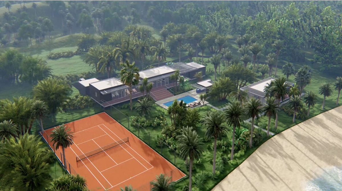
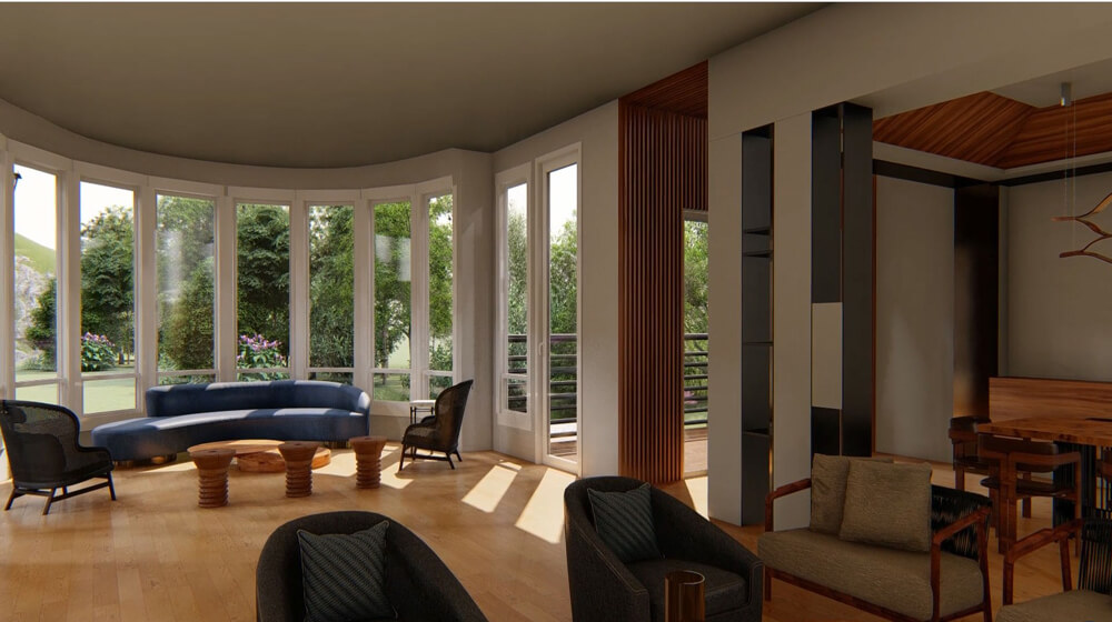
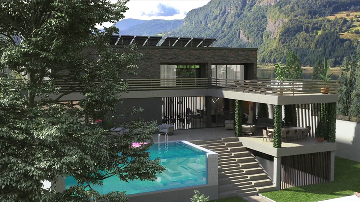
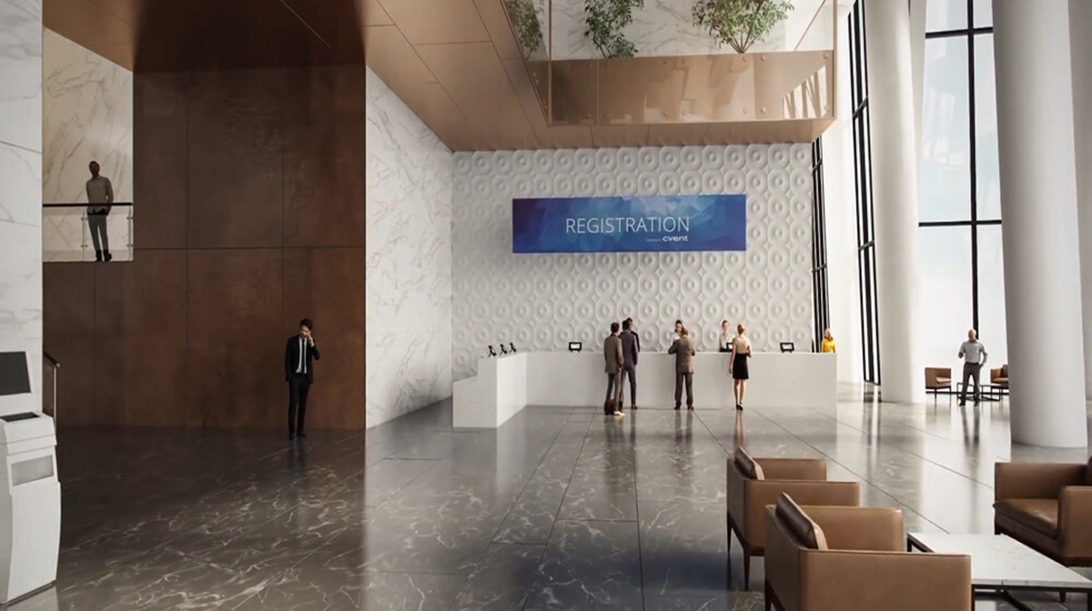
It might sound like an obvious thing to include in an architecture design brief, but it’s important to mention what kind of lot needs to be animated. The thing is, visualizing residential and commercial buildings differs in techniques. For example, the selling points of a commercial lot are the infrastructure, convenience and efficiency – and 3D animators accentuate those points in the architecture animation video. As for the residential buildings, specialists focus their efforts on making the location and the dwelling as gorgeous as possible, making potential clients want to move in.
#2. Indoors Or Outdoors
Another thing to include in an architecture animation video brief is what should be the focus of the building: exterior or interior? For instance, a client has decided to order an animated walkthrough of a restaurant. An architecture animation company can create the video depicting the outside or the inside of the building, and the options vary from there. The animation can start outside, briefly showing the front of the building, and then pay extra attention to the interior. Or maybe only depict the inside elements of the restaurant? Or show the selling points of both interior and exterior? This is why architecture design briefs should always mention what is the focus of the animated walkthrough.
#3. Elements Of The Lifestyle
Showcasing just the the product is fine, but what if we spice it up a bit? Lifestyle elements can give a more natural feel to the video, make it more believable. For example, 3D specialists can add cars driving or parked outside the building, or people walking around, and, of course, contextual decor. Some elements can be omitted, depending on specific vision of the project, but making the architecture animation video feel more real can go a long way to make the viewer pay attention.
#4. Budget Requirements
Ideas may be grandiose, but planning the budget is a key element of ordering the video. Always ask client manager what can lower architectural animation cost without sacrificing quality. Sometimes less is more, and multimedia projects are great examples of this principle. Architecture animation video that drags on for too long can ruin the intended effect during presentations or ads, so length should be optimized. Perhaps some elements are not necessary and just increase the price. Carefully planning budget for an animated walkthrough with the project manager will make it look great and be more cost efficient.
#5. Materials
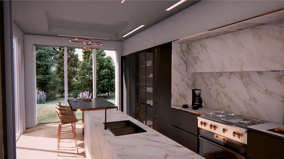
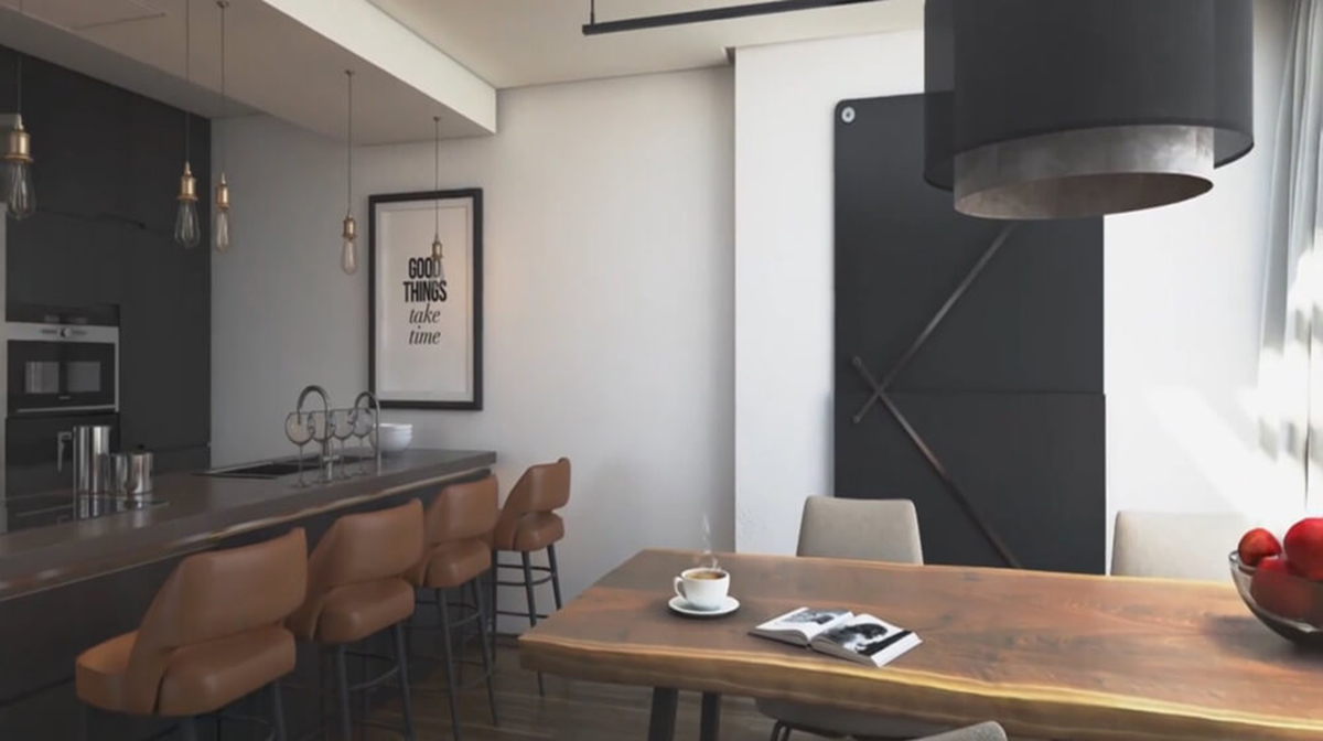
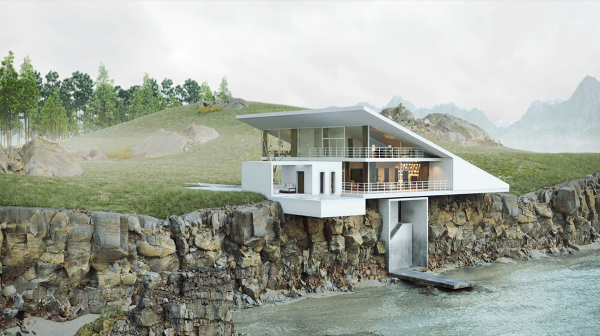
But what about the building itself? What is it supposed to be built of? Material type matters a lot when creating 3D graphics, especially in motion. A slight difference in texture is all that stands between an object looking natural and unrealistic. Another thing that affects the visuals is lighting. Different surfaces reflect or absorb light differently, not to mention glass or other transparent matter. Needless to say, it’s important to mention what buildings and objects within them are made of in design brief, otherwise the architecture animation video is going to look extremely unnatural.
#6. Particular Design Features
Clients’ design ideas highly matter to 3D artists, as such design briefs should mention what extra features one wants to be included in an architecture animation video. Maybe a residential or commercial lot has to be visualized in a certain location? Or what about setting the video during a certain time of day? Or adding some unique objects to accentuate distinctive features of a particular project in comparison to competitors? Client’s vision will be fulfilled if he mentions it accurately in design brief.
#7. Personal Additions
Speaking of individual approach to an architecture animation video, maybe one would want to add some author’s touch to it. Add personal elements to the script? Stylize the animation? The only limits are imagination and budget.
And there you have it – by mentioning these 7 things in your architecture animation video brief, you’ll get results you envisioned. Of course, reviewing and revising the document with a personal project manager is a normal part of the process, but it will only make original ideas even better. Speaking of which, why don’t you try out CGI videos for your residential and commercial works? Get in touch with our architectural animation company and visualize your construction projects in motion!



Thank you for good info
Hi,that’s actually excellent, keep up writing.
This info is priceless. Share more about this.
So glad I’ve found this article before starting work. I can just show it to my clients!
Very good blog!
Very informative post
Now this is really interesting, thank you
The fact that you can take clients inside and outside project virtually is incredibly cool
Heya i’m for the first time here and like what you do
I’m not that much of a online reader to be honest but
your blogs really nice, keep it up! I’ll go ahead and bookmark your site to
come back later. Cheers
Good point! Technical assignment is the first step to getting a great product. Never thought about 3D animation that way though, but it totally makes sense
Peculiar article, totally what I needed.
I always pay attention to filling out the brief. As a marketer, I totally understand the importance of setting a task clearly
Thank you for excellent information
Fantastic job!
I’ve been at a house presentation with a virtual tour, very cool. Keep thinking about trying it
Your 3D artists are good with materials, congrats. I can see it even in the screen pics
Thanks, experience tells me the brief is 50% of success.
Good advice, thanks
Good job with these renderings
Thanks for another informative piece!
Yeah, it’s just like with advertising. The brief is king
Great advice! By any chance, have you got any info on typology of 3D animations? That would be so cool
Hi, Christine!
Thank you for appreciation, the author will love that) Yes, we’ve got just the right article for you https://cgiflythrough.com/blog/photorealistic-animation-typology/
Hi there! Thank you for great advice
Greetings from Florida! superb blog!
Fantastic website. Lots of helpful info for a marketer here.
Great article.