Architecture presentation is where the magic of the project happens. If an Architect plays his cards right, it’s when his client clicks with the design and wants to see the results as soon as possible. The ideal outcome is when the only questions left at the end of the speech are “How much?” and “When do we start?”
But things don’t always go smoothly. Sometimes, they go likes this: during the presentation, the client sits with a blank face. He does not have a single question in the end and calls back a few days later to inform that he would like to explore other options and see what other firms have to offer. So much time wasted! The project was excellent, clients – initially forthcoming and nice, yet something happened during the meeting. As the Architect looks through the notes, he realizes that the trouble was in the way he had presented his brainchild.
Presentation is 50% of success. It requires thorough preparation, creativity, excellent visual material – like architecture animation videos, communication skills and a little bit of acting. However, most of these things are long to work on. Are there points for making the next presentation a success? There sure are a few simple rules to start applying right now. Let’s find them out!
#1. Use an Index to Prepare the Audience
The Architect can prepare an Index with a short presentation plan that outlines the most important checkpoints. It will be much easier for people to follow the presenter, mentally structure the mass of new information and perhaps even make notes on some of the points. Furthermore, the creation of printed materials will show the engagement and diligent preparation of the architect.
#2. Start Architecture Presentation with the End
There are many ways to build the structure of an architecture presentation, each having its advantages. Success depends on implementation. But beginning with results is a sure attention-catcher. Logically, one would put them in the end, first walking the audience through the technical assignment, process, and challenges of the project development, building up the intrigue. But doesn’t it make a better sense to give the audience what they want first? That would get them interested. They would better understand what’s going on and be more involved in discussing details, having seen the overall picture.
#3. Use High-End Visual Materials
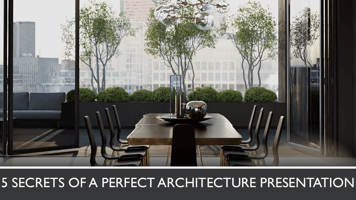
Visual materials of the architecture presentation should be top-notch – both informative and looking high-end. The whole project will be judged by them, so all visuals, including drawings and sketches should be impeccable. Instead of references, it’s wise to get a 3D architecture video. It helps to easily demonstrate a project at its best, show all the details and strength of the design, and make a strong impression. For who wouldn’t be impressed by a photorealistic tour around the property which hasn’t been built yet?
#4. Avoid Too Much Detail
It’s perfectly understandable that the Architect loves to talk about his art. So when asked a question at an architecture presentation, he feels in his element and can get carried away a little. Going into the details is time-consuming, not to mention the audience might not need or understand them. There is a simple way to avoid it: when asked a question, the Architect should give a brief answer and then ask if the audience wants a more elaborate one. If that’s the case, better to warn that a detailed explanation will take extra time.
#5. Forget about Professional Slang
Professional slang is great for communication with colleagues. It perfectly conveys the technical aspects and is quick and emotional when necessary. It is also a sign of expertise: so much so that when 3D artists in a 3D animation studio speak it, only those who work in the sphere can understand them. And that is exactly the reason to avoid professional slang at an architecture presentation: the audience won’t understand a thing. The speech should be listener-oriented so that communication be effective. So whenever there is a need for using professional terminology, it’s better to explain every word and notion.
Preparing a successful architecture presentation is a journey rather than a goal. An Architect needs to take care of every aspect: language, structure, intonation, handout materials, and of course, get prime quality visuals. Want to take your clients on a tour through your amazing project? Then click the button below and contact CGI Flythrough architecture animation company. We will create a CG video showing the project with accuracy and Hollywood impact!


Like!! I blog frequently about architecture and I really thank you for your content. The article has truly peaked my interest.
Now that makes sense. Thank you, I’ve been looking for the info for a while
Thank you for this excellent article. Keep posting!
Thanks for sharing, by the way
Exceptionally well written!
Informative article, thank you! And incredibly well-illustrated